Some projects just feel aligned from the very beginning and this was one of them.
Story Box Drama is a child-centred service blending storytelling, drama, music and sensory play with communication-supportive strategies to help children build confidence, connection, expression and communication.
They work with schools and local authorities to deliver workshops and events, alongside local classes and children’s parties. At the heart of it all? Creating joyful, safe spaces where children can truly thrive.
But as their business evolved, something started to feel out of step.
When a Brand No Longer Fits
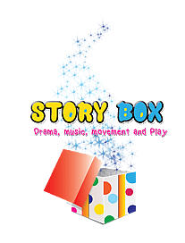
Like many growing businesses, Story Box had developed beautifully over time but their branding hadn’t quite kept up.
It no longer reflected the depth of their work.
It didn’t fully communicate their professionalism to schools and SENCOs.
And it wasn’t attracting the right audience in the way it once had.
They had grown and their brand needed to grow with them.
The Brief: Playful, But Professional
This wasn’t about starting from scratch. It was about realignment.
The new brand needed to feel:
Warm and imaginative — without becoming childish
Specialist and trusted — appropriate for schools, SENCOs and local authorities
Inviting for parents — calm and reassuring when needs feel complex
The balance was key.
Story Box is joyful and creative but it’s also structured, considered and deeply child-led. The identity needed to hold both of those truths confidently.
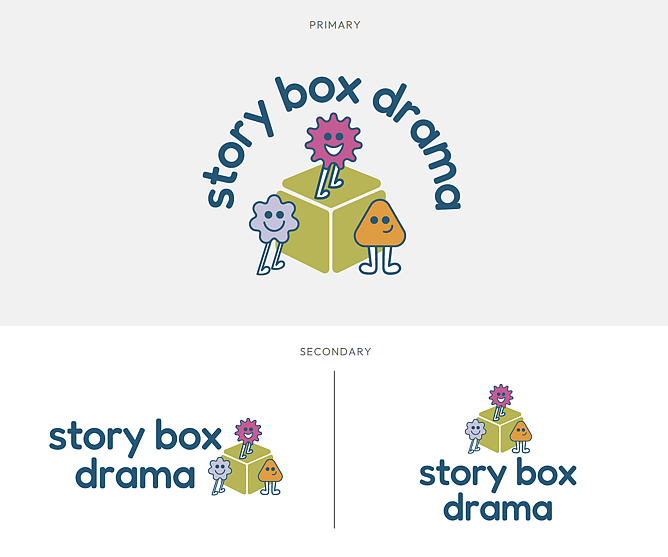
The Logo: Confident Simplicity
The new logo was designed to be simple, confident and flexible.
Rather than leaning on obvious, literal symbols, we focused on clean structure and clarity. This allows it to sit comfortably in school documents and reports, while still feeling warm and creative in child- and parent-facing spaces.
It’s recognisable.
It’s adaptable.
And most importantly, it feels aligned with who they are now.
The Colours: Creativity Meets Credibility
Colour played a huge role in striking the right balance.
We intentionally built a palette that blends playfulness with grounding professionalism:
Warm orange – energetic and expressive
Soft olive green – natural and supportive
Deep teal – strong and grounding
Soft lilac – calm, gentle and reassuring
Bold pink – confident and distinctive
The soft lilac adds a sense of calm and reassurance particularly important when working in SEN spaces, while the deeper tones anchor the palette in credibility.
Together, the colours create something that feels imaginative, but not childish. Friendly, but not informal.

Typography: Structured, With Personality
We chose Fredoka and Montserrat to bring in both clarity and warmth.
Montserrat offers professionalism and clean structure - ideal for reports, proposals and school communications.
Fredoka softens the edges slightly, bringing a subtle sense of play and approachability without undermining credibility.
It’s structured where it needs to be.
Soft where it matters.
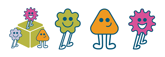
The Illustrations: Where the Magic Lives
This is where the personality really comes alive.
The illustrations introduce warmth, movement and imagination - supporting the storytelling feel that sits at the heart of Story Box Drama.
They bring energy and humanity to the brand, while the overall design framework keeps everything structured and considered.
A Brand That Feels Like Them
Story Box’s new identity now reflects:
A playful, creative approach that supports communication and confidence
A grounded and structured way of working with children
A visual identity that feels credible for schools and local authorities
It’s flexible.
It’s future-focused.
It feels aligned.
That’s always the goal. A brand shouldn’t just look good - it should feel like home for the business behind it.